Nebula Object Member List Colum made wider
 Freshman Member

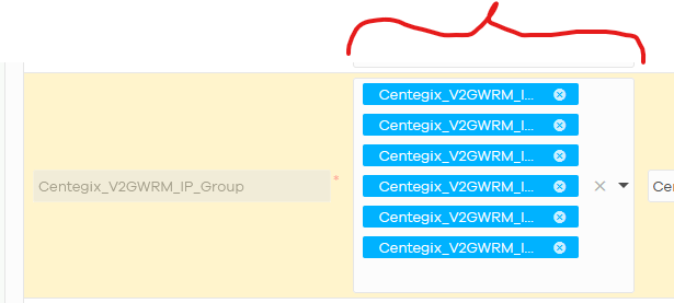
The Member List colum in the nebula objects group definitions really needs to be made wider to allow you to see the entire name of the members in the list plus the (x) control icon.
I would suggest having someone review every column in nebula that cannot be resized (as in the case here) to make sure that either the colum can be user resized OR that it is sized appropriately to display the full column data. There are a few areas where labels are cut off like this when you use long descriptive names.
Thanks!
Comments
-
Hi @Ratsnackbar,
Thank you for your feedback. We can understand the concern when using long descriptive names in the object member list.
At present, when you hover your mouse over a member, the full name will appear in a tooltip. However, we see that your request is specifically about making the column wider or resizable so that the full names can be displayed directly. Could you share more about your usage scenario where having the names fully visible in the column (without hover) would benefit your workflow or operations?
Your additional input will help us better evaluate the impact of this feature request.
Zyxel Tina
0 -
Hi Tina,
In many of our object names we add an identifier to the end of the object. As you can see in the screenshot it's not possible to differentiate between the objects displayed.
Without the display of the full object name it makes it difficult to identify if all necessary objects which belong in the group are present.
0 -
Hi @Ratsnackbar,
Understood! We'll be monitoring the votes and comments as part of our evaluation process.
If anyone likes this idea, please show your support by leaving a comment or voting for it.
Zyxel Tina
0
Categories
- All Categories
- 442 Beta Program
- 2.9K Nebula
- 221 Nebula Ideas
- 128 Nebula Status and Incidents
- 6.5K Security
- 610 USG FLEX H Series
- 347 Security Ideas
- 1.7K Switch
- 84 Switch Ideas
- 1.4K Wireless
- 53 Wireless Ideas
- 7K Consumer Product
- 299 Service & License
- 483 News and Release
- 92 Security Advisories
- 31 Education Center
- 10 [Campaign] Zyxel Network Detective
- 4.8K FAQ
- 34 Documents
- 88 About Community
- 105 Security Highlight

 Zyxel Employee


